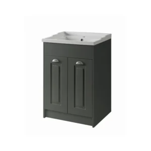
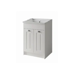
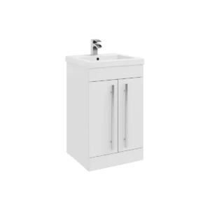
Choosing floor standing vanity units by colour helps the basin area work with your tiles, taps, mirror and wider bathroom furniture. Dark finishes such as black and anthracite add contrast, while grey and white keep the look calm and easy to coordinate. Oak brings warmth, and colours like blue, green or pink can make the vanity unit a feature. Use this category to compare coloured floor standing vanity units by finish before narrowing down the size and storage layout.
-
Red Floor Standing Vanity Units
3 products -
Stone Floor Standing Vanity Units
7 products -

Anthracite Floor Standing Vanity Units
5 products -

Blue Floor Standing Vanity Units
4 products -

Green Floor Standing Vanity Units
5 products -
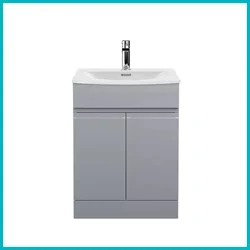
Grey Floor Standing Vanity Units
19 products -
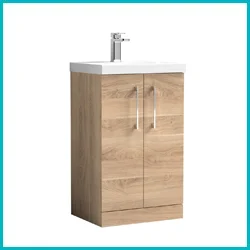
Oak Floor Standing Vanity Units
2 products -

White Floor Standing Vanity Units
26 products -
600mm Floor Standing Vanity Units, Bathroom Furniture, Bathroom Vanity Units, Floor Standing Vanity Units, Grey Floor Standing Vanity Units, Grey Vanity Units
Kartell Astley 600mm Matt Grey Traditional Bathroom Vanity Unit
Original price was: £392.00.
Our Price: £243.49Current price is: £243.49. -
600mm Floor Standing Vanity Units, Bathroom Furniture, Bathroom Vanity Units, Floor Standing Vanity Units, White Floor Standing Vanity Units, White Vanity Units
Kartell Astley 600mm Matt White Traditional Freestanding Vanity Unit
Original price was: £392.00.
Our Price: £253.49Current price is: £253.49. -
500mm Floor Standing Vanity Units, Bathroom Furniture, Bathroom Vanity Units, Floor Standing Vanity Units, White Floor Standing Vanity Units, White Vanity Units
Kartell City 500mm Gloss White Handleless Drawer Vanity Unit
Original price was: £511.00.
Our Price: £273.99Current price is: £273.99. -
500mm Floor Standing Vanity Units, Bathroom Furniture, Bathroom Vanity Units, Floor Standing Vanity Units, Grey Floor Standing Vanity Units, Grey Vanity Units
Kartell City 500mm Storm Grey Gloss Handleless Drawer Vanity Unit
Original price was: £511.00.
Our Price: £273.99Current price is: £273.99. -
600mm Floor Standing Vanity Units, Bathroom Furniture, Bathroom Vanity Units, Floor Standing Vanity Units, White Floor Standing Vanity Units, White Vanity Units
Kartell City 600mm Gloss White Handleless Drawer Vanity Unit
Original price was: £520.99.
Our Price: £321.49Current price is: £321.49. -
600mm Floor Standing Vanity Units, Bathroom Furniture, Bathroom Vanity Units, Floor Standing Vanity Units, Grey Floor Standing Vanity Units, Grey Vanity Units
Kartell City 600mm Storm Grey Gloss Handleless Drawer Vanity Unit
Original price was: £520.99.
Our Price: £321.49Current price is: £321.49. -
600mm Floor Standing Vanity Units, Bathroom Furniture, Bathroom Vanity Units, Floor Standing Vanity Units, Grey Floor Standing Vanity Units, Grey Vanity Units
Kartell Matrix 600mm Storm Grey Gloss Floor Drawer Vanity Unit
Original price was: £523.00.
Our Price: £329.99Current price is: £329.99. -
500mm Floor Standing Vanity Units, Bathroom Furniture, Bathroom Vanity Units, Floor Standing Vanity Units, Grey Floor Standing Vanity Units, Grey Vanity Units
Kartell Purity 500mm Storm Grey Gloss 2 Door Floor Vanity Unit
Original price was: £318.00.
Our Price: £204.99Current price is: £204.99. -
500mm Floor Standing Vanity Units, Bathroom Furniture, Bathroom Vanity Units, Floor Standing Vanity Units, White Floor Standing Vanity Units, White Vanity Units
Kartell Purity 500mm White 2 Door Floor Vanity Unit
Original price was: £298.00.
Our Price: £191.49Current price is: £191.49. -
600mm Floor Standing Vanity Units, Bathroom Furniture, Bathroom Vanity Units, Floor Standing Vanity Units, White Floor Standing Vanity Units, White Vanity Units
Kartell Purity 600mm Gloss White 2 Drawer Floor Vanity Unit
Original price was: £476.00.
Our Price: £257.99Current price is: £257.99. -
800mm Floor Standing Vanity Units, Bathroom Furniture, Bathroom Vanity Units, Floor Standing Vanity Units, White Floor Standing Vanity Units, White Vanity Units
Kartell Purity 800mm Gloss White 2 Door Floor Vanity Unit
Original price was: £415.00.
Our Price: £270.49Current price is: £270.49. -
800mm Floor Standing Vanity Units, Bathroom Furniture, Bathroom Vanity Units, Floor Standing Vanity Units, White Floor Standing Vanity Units, White Vanity Units
Kartell Purity 800mm Gloss White 2 Drawer Floor Vanity Unit
Original price was: £558.00.
Our Price: £274.95Current price is: £274.95.